
Most people don’t consciously notice the colors on a website — but their brain does. Color is one of the fastest ways the human mind forms a first impression, and research suggests that people make a subconscious judgment about a product or business within 90 seconds of first viewing it, with up to 90% of that assessment based on color alone. For small business owners, that means your color choices are doing a lot of heavy lifting before a single word gets read.
What Different Colors Communicate to Customers
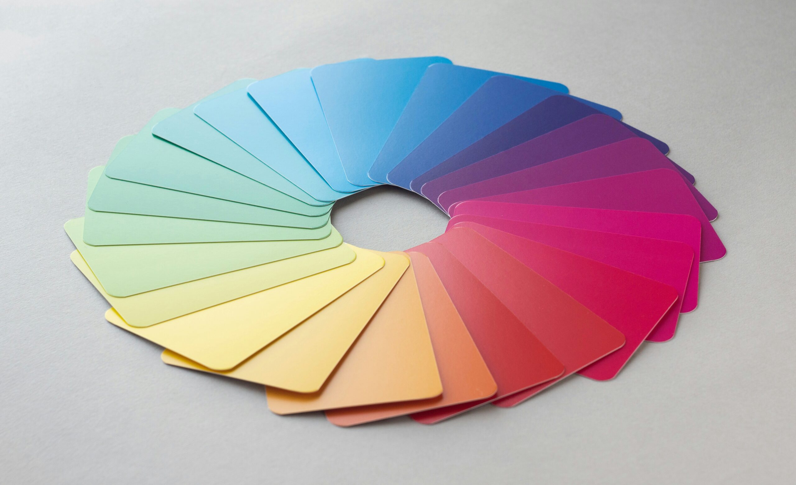
Every color carries psychological associations that have been reinforced through culture and experience. Blue conveys trust, reliability, and professionalism — which is why it dominates the financial, legal, and healthcare industries. Green suggests growth, health, and stability, making it popular for wellness brands and financial services. Red creates urgency and excitement, which is why it’s used heavily in sales and food industries. Black communicates luxury and sophistication. Orange and yellow feel friendly and energetic, often used by brands trying to appear approachable and fun. None of these are hard rules, but ignoring them entirely can send mixed signals to your customers without you ever realizing it.
Consistency Builds Recognition
Beyond individual color meanings, consistency is what turns a color palette into a brand. When your website, social media, business cards, and signage all use the same colors, customers start to recognize your business instantly — even before they read your name. This kind of visual recognition builds familiarity, and familiarity builds trust. Inconsistent colors across different platforms, on the other hand, make a business feel disorganized and unpolished, which quietly erodes customer confidence even among people who couldn’t explain why they feel that way.
The Mistake of Choosing Colors You Personally Like
One of the most common web design mistakes small business owners make is choosing a color palette based purely on personal preference. Your favorite color might be orange, but if you run an upscale legal consultancy, orange could undermine the professional image you’re trying to project. Good web design separates personal taste from strategic communication. The right color palette for your website is the one that resonates with your target customer and reinforces what makes your business trustworthy — not necessarily the one you’d paint your living room.
Contrast, Accessibility, and Readability
Color choices also have a practical side that directly impacts how usable your website is. Poor contrast between text and background colors makes your site hard to read, frustrating visitors and causing them to leave quickly — which signals to Google that your page isn’t delivering a good experience. There are also accessibility standards to consider, since a significant portion of the population has some form of color blindness. A web designer who understands color theory will build a palette that’s not only visually appealing but accessible and readable for everyone, reducing bounce rates and improving the overall performance of your site in search rankings.
Getting Your Color Palette Right From the Start
Changing your color palette after your website is live is more disruptive than most people expect — it touches every page, every graphic, and every piece of branded content you’ve created. Getting it right from the beginning saves significant time and money. If you’re building a new website or considering a redesign, a professional web designer will help you choose colors that align with your brand values, appeal to your target audience, and stand out from your competitors in a meaningful way rather than blending into the noise.


Add comment